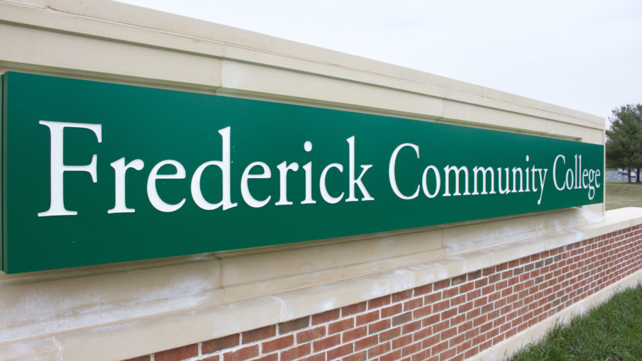
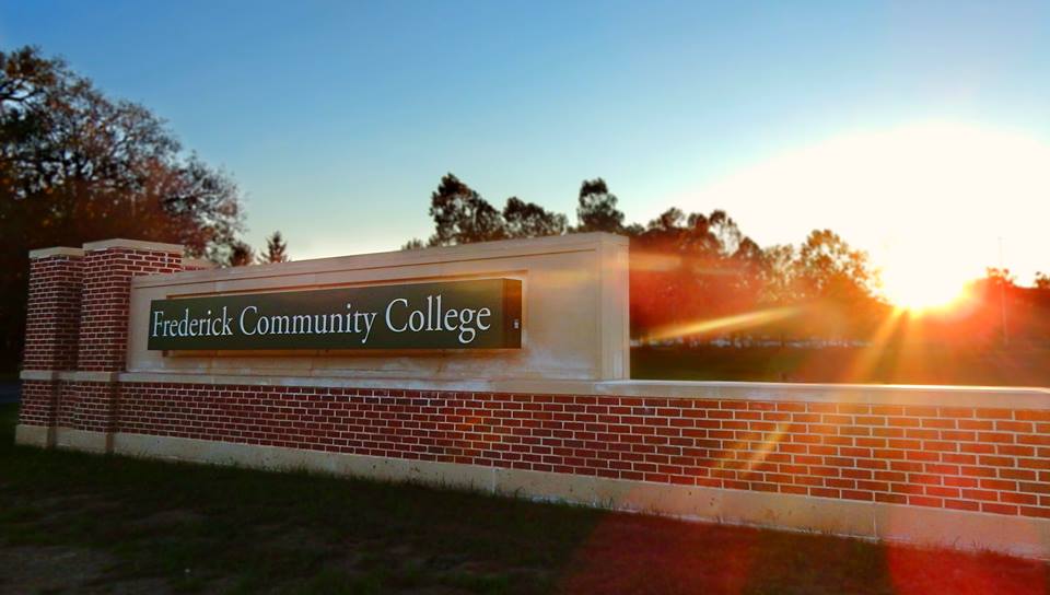
Frederick Community College has added two new large stone entrance signs at the main and north entrances of the campus, which replace the former green wooden signs that have existed since the late 1970s.
Clearly visible from Opossumtown Pike, commuters can’t help but to notice the well-crafted, large stone signs.
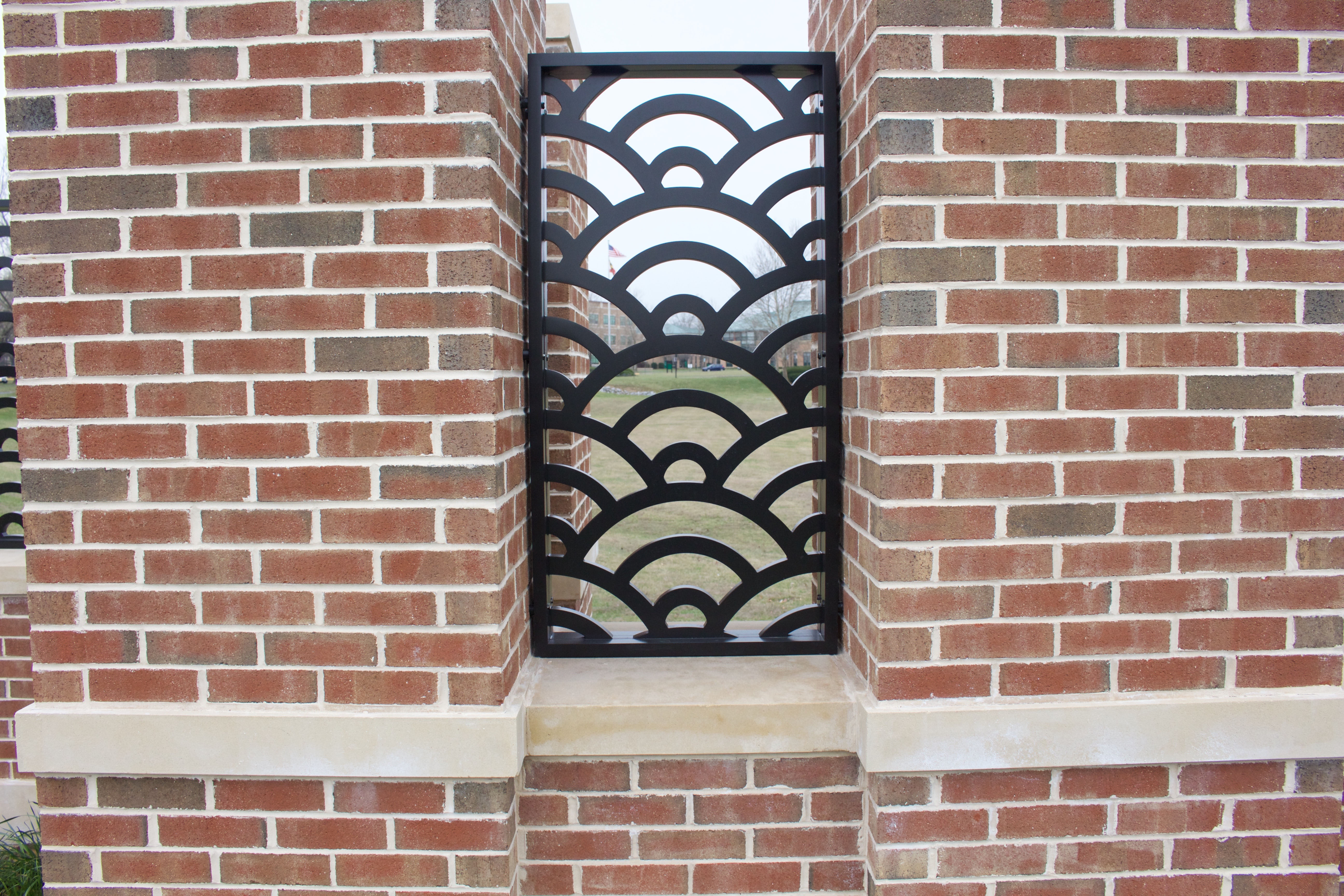
Frederick Community College lines the middle, with white text and a green background. There are also green circle patterns on the top and sides which are suppose to symbolize the mountains in Frederick. Even at night these signs are visible from the road with built-in lights illuminating the sign for students taking night classes.
Grabbing visual attention was not the sole purpose of the why these signs were implemented during the summer of 2016. A few years ago, officials at the college decided new signs would benefit the future of the institution.
“The Capital Improvement Project (CIP) was devised in order for these signs to begin creation,” said FCC communications coordinator Caroline Cole. “CIP had to first be approved by the City of Frederick, but would ultimately be funded through the county.”
Many may wonder how FCC afforded these new signs, and if they cost students anything.
“This was a county-funded capital improvements project,” said Vice President of Finance and Human Resources Dana McDonald. “No operating budget funds, including student tuition or fees, were used to pay for the entrance signs. Tuition and fees were not directly or indirectly impacted by this project.”
Compared to the weathered green and black signs that had unmistaken scratch marks and dings, these stone signs are practically indestructible, and built to last.
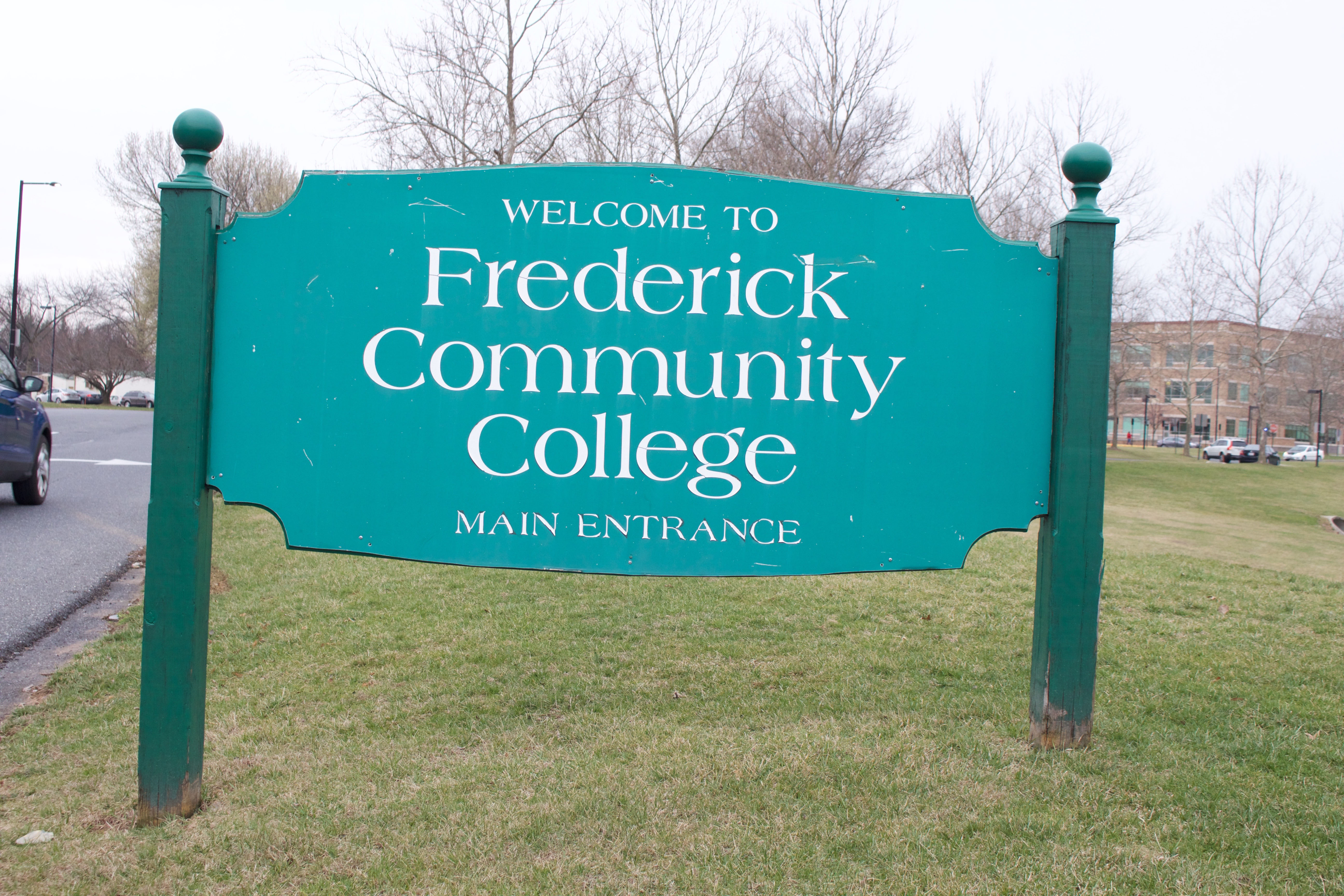
With the older, less attractive signs standing on campus for almost 40 years, the stone signs should triple that lifespan, already showing their value.
“The main entrance sign after completed construction cost $220,000 and the other slightly smaller sign at the northern entrance cost $102,750.75,” Cole said.
Although that may seem like a hefty price, these signs were funded over a span of a few years, and will ever directly impact student tuition.
These signs are part of just a few upgrades that the college has recently encountered within the past two years.
Aside from the new entrance signs being upgraded, FCC is gradually rebranding. There are strong amounts of green, black, and white — the institutions colors — implemented in designs.
These designs also match other smaller signs on campus that are disbursed throughout the campus to label buildings, parking lots, and maps.
Along with the new Learning Commons, updated vending machines, Under Armour apparel in the bookstore, and smaller signs for buildings and parking lots, the new entrance signs are just one of many improvements to the campus.
You can follow Evan Engelhard on Twitter at @Evan_Engelhard
